
Create 3D Logo in Blender: Step-by-Step Modeling Guide
Learn how to create a 3D logo in Blender with SVG import, extrusion, beveling, lighting, and export tips for web and print.
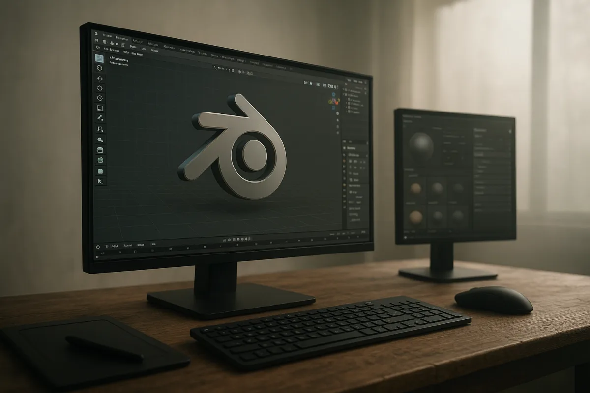
Start with the logo file, not a screenshot
The first problem is usually not modelling. It is source quality. A client may send a tiny PNG copied from a website, but that is a poor foundation for a logo intended for animation, web interaction, posters, or product mock-ups.
Ask for an SVG first. EPS, AI, and PDF are also vector formats commonly supplied in logo packages, but SVG is the most direct starting point for Blender’s curve-based workflow. Vector artwork retains the designed contours instead of turning pixel stair-stepping into geometry. [10][11]
I would work in Blender 5.0 for this guide, partly because the application’s supported import and image-format options change over time. Keep the original vector file untouched, and make a separate working copy before converting or simplifying anything. [12]
Import the SVG, inspect every letterform, then look for the awkward realities of brand artwork: overlapping shapes, compound paths, open curves, microscopic counters, and unusually sharp corners. Those details may be invisible in a flat logo but become obvious once depth and light reveal them.
The established Blender workflow is import, convert the curves to a mesh, extrude for depth, then bevel the exposed edges. [1] Do not convert immediately just because it feels like the next button to press. Curves remain easier to revise while you are checking proportions.
Solve the silhouette before adding depth
A 3D logo still succeeds or fails as a 2D shape. Before extrusion, place a plain camera roughly where the finished promotional image will be viewed, then check whether the logo remains recognisable at the actual crop and intended size.
This matters especially for lettermarks. A deep extrusion can make inner counters disappear, overlap neighbouring letters, or produce a visual weight that the original identity never had. The goal is usually dimensional branding, not a new typeface designed by the bevel modifier.
Once the outline is approved, convert it to mesh and give it depth. Extrusion produces the sidewalls, while beveling rounds or chamfers the transitions between face, sides, and back. The bevel is not merely decorative: it creates surfaces that can receive highlights. [1]
Keep the bevel width proportionate to the logo’s smallest visible features. A broad bevel may look polished on a simple monogram but can consume thin strokes or close small interior gaps. This is a judgement call, not a universal numerical setting.
There is no reliable research-backed sculpting workflow specific to Blender logo work, and that is worth saying plainly. Sculpting is rarely the first answer for a clean promotional mark. Use it only when the concept calls for clay, carved foam, melted wax, or another intentionally irregular treatment.
Keep topology proportional to the destination
After conversion, inspect the mesh where curves become dense. Circular letters, script logos, and imported artwork with excessive points can create far more geometry than a campaign asset needs. Simplification is useful when it preserves the visible curve and removes no meaningful shape information.
There is no single optimal polygon count for a logo. A web asset can sit around 10,000 to 50,000 triangles, while a mobile asset should stay under 20,000 triangles. Those are delivery ranges, not targets to reach for their own sake. [7][8]
For an interactive web logo, the practical constraint is often download size rather than the triangle number alone. A GLB between 1 MB and 3 MB is a useful goal, with 5 MB as a sensible upper limit for many web uses. [7][9]
3D printing asks a different question. Guidance places many print-ready models around 100,000 to 500,000 faces, but watertightness matters more than chasing density. [7] A beautiful render mesh with holes, self-intersections, or detached bevel fragments is not automatically printable.
That distinction is important for promotional work. A logo rendered for a billboard may only need to look correct through one camera. A logo supplied as a downloadable GLB or physical trophy needs geometry that survives inspection from every side.
Build materials for the lighting you plan to use
The next trap is trying to make a logo look premium through material complexity alone. A polished metal shader under flat, featureless illumination still looks flat. Materials describe the surface, but lighting gives that surface readable form. [6]
For a straightforward campaign render, begin with a restrained material: a base colour that matches the brand, controlled roughness, and either metallic or non-metallic behaviour appropriate to the intended object. Let the face, bevel, and sidewall read as distinct planes before adding texture detail.
Texture resolution should follow the output. Digital assets commonly use 512 by 512 up to 2048 by 2048 pixels. [8][9] A small web logo does not benefit much from a large texture map that inflates the GLB and delays loading.
Print calculations are different. A 10-inch by 10-inch image prepared at 300 DPI requires 3000 by 3000 pixels. [10][11] That figure applies to the final printed image, not automatically to every texture used inside Blender.
Use PNG where transparency and lossless compression matter, such as a logo rendered over a transparent background for layout work. [10][11] JPEG may be smaller, but its compression artifacts are particularly unkind to sharp edges, flat colour fields, and fine brand marks.
For digital display, work in RGB and set Blender colour management to sRGB so the render is aimed at the normal web and screen colour space. [7][12] CMYK belongs to the print production handoff, where the printer or designer manages the final conversion.
Light the bevel, then judge the material
Set up three-point lighting before committing to final material values. The basic arrangement is a key light that establishes direction, a fill light that controls shadow density, and a rim light that separates the logo from its background. [2]
For a simple floating logo, put the key where it reveals the front face and catches one bevel edge. Use the fill sparingly. If the fill removes every shadow, the depth you modelled becomes difficult to see.
The rim light is particularly useful for dark logos on dark backgrounds, or glossy marks whose silhouette needs separation. It should trace an edge or back contour rather than create a second competing key direction. [2]
Light size controls shadow softness. A larger apparent source produces softer transitions, while a smaller source makes crisper shadows and tighter specular highlights. [5] Neither is inherently more professional. Soft light often suits cosmetics or corporate identity work, while sharp light can suit automotive or technical branding.
An HDRI can provide believable environmental reflections, especially on metallic, glossy, or transparent logo treatments. [5] Do not use one merely because reflective materials are present. Rotate or replace it until the reflections describe the shape rather than adding random bright streaks.
Colour temperature can help separate the key and fill, such as a slightly warm key against a cooler environment. [5] Keep that contrast modest if brand colours must remain accurate. A dramatic cyan-and-orange setup can easily turn a precise logo colour into a different identity.
Ambient occlusion can reinforce tight contacts and shallow engraved details, but apply it carefully. [5] Excessive occlusion muddies clean branding and makes a smooth acrylic or painted object appear dirty. If the bevel is doing its job, it should not need heavy artificial darkening.
Choose Eevee or Cycles for the deliverable
In Blender 5.0, choose the renderer according to the image requirement and schedule. Eevee is real-time oriented and can render in seconds per frame, making it useful for layout tests, social variants, and motion graphics where iteration matters. [3]
Cycles is built for more physically based results, but render time can range from roughly five seconds to more than 30 minutes per frame on mid-range hardware, depending on resolution, materials, lighting, and scene complexity. [3][4]
That does not mean Cycles is automatically the correct choice. A flat-colour logo with clean studio lighting may look entirely appropriate in Eevee, while glass, layered transparency, complex reflections, and close-up metallic surfaces are more likely to justify Cycles’ extra time. [3]
Render low-cost previews while you judge camera angle, extrusion depth, and light placement. Save high bit-depth renders for the final output where possible, particularly when the image needs colour correction or compositing before publication. [7][12]
Prepare separate deliverables, not one compromised master
A promotional logo often needs several exports: a still image for social media, a transparent PNG for layout, a web model, and perhaps a high-resolution print image. Build one clean master scene, but produce versions tailored to each destination.
For web interaction, GLTF or GLB is preferred because it is designed for web delivery, and GLB can embed textures in a single file. [7][9] Before export, apply transforms, reduce unnecessary geometry, confirm UV mapping, and test the result in the destination platform.
Unapplied scale is a common source of trouble. It can affect modifier results, normal behaviour, and the apparent scale of a model after export. Applying transforms before delivery makes the exported asset more predictable. [7]
Do not assume a web platform accepts any file size. General web upload guidance can impose limits below 20 MB, while a practical interactive GLB target is much smaller. [8][9] Optimize the actual asset rather than exporting a cinema-quality master and hoping compression will rescue it.
For final digital images, export an RGB file and preserve transparency with PNG when the design team needs to place the logo over other artwork. [10][11] For print, supply the required high-resolution render and coordinate CMYK conversion with the print workflow rather than treating Blender’s RGB render as press-ready artwork.
Finally, inspect the render at its real use size. A bevel that looks elegant at 4K may vanish in a small social avatar, while a subtle roughness texture may become distracting on a large poster. Promotional 3D logo work is successful when the asset survives its actual context, not when the viewport looks impressive.
Frequently Asked Questions
How do I import an SVG logo into Blender for 3D modeling?
Start by obtaining a vector logo file in SVG format, as it preserves clean curves and scales well in Blender. Import the SVG into Blender 5.0, then inspect the curves for any overlapping shapes or irregularities before converting them to a mesh. Keep the original vector file untouched and work on a separate copy to maintain quality.
What is the best way to extrude and bevel a logo in Blender?
After approving the 2D silhouette, convert the curves to a mesh and extrude to add depth. Apply a controlled bevel to the edges to create surfaces that catch light and avoid the logo looking like a flat cut-out. Bevel width should be proportionate to the logo’s smallest features to maintain clarity and visual balance.
How can I optimize topology for a 3D logo in Blender?
Inspect the mesh after conversion for areas with dense geometry, especially in circular or script logos. Simplify the mesh by removing unnecessary points while preserving the visible shape. Target polygon counts depend on the destination: around 10,000–50,000 triangles for web assets and under 20,000 for mobile.
What lighting setup works best for rendering a 3D logo in Blender?
Use a three-point lighting setup consisting of key, fill, and rim lights to define the form and add depth. Incorporate HDRI reflections for realistic lighting and adjust light size to create soft shadows. This approach helps establish a professional product-shot look before refining materials.
How do I export a 3D logo from Blender for web or print?
Before exporting, apply all transforms and verify UV mapping. For web use, export the model as a GLB file with embedded textures, keeping the file size ideally between 1 MB and 3 MB. Separate RGB files are suitable for digital use, while CMYK files should be prepared for print to ensure color accuracy.
How we researched this
This article was assembled from 12 cited references.
Nothing here is based on hands-on testing. Where a figure or finding appears, it belongs to the source cited beside it, and the writing says so rather than implying otherwise. Every source is listed below so you can check it.
Sources
- Creating and transforming a 3D logo using Blender | Alpha3D
- How to use key, fill and rim lighting in 3D art
- Cycles and Eevee: which renderer should we choose? | iRender
- Blender Cycles Render Time by Resolution | 1001Ferramentas
- Best Practices for Lighting in 3D Architectural Visualization - 3DAStudio Architectural Visualization and 3D Rendering Service – Seattle
- Stop Blaming Your Materials: The Real Reason Your Blender Renders Look Lifeless — BlenderCG
- Best Practices Exporting Models from Blender
- 7 Common Mistakes When Using 3D Models for eCommerce
- How to Export a 3D Model with Textures in Blender
- What Files Should A Logo Designer Provide? Complete Guide
- Logo File Formats Explained: SVG, PNG, JPG, PDF, EPS, AI, WebP | Logo Guide | LogoLabs
- Supported Graphics Formats - Blender 5.0 Manual
Related Articles
Create Game Asset in Blender: Modeling, Topology, and Export
Learn how to create game assets in Blender with tips on modeling, topology, optimization, and exporting for game engines.

Create Realistic Sky in Blender
Learn how to create a realistic sky in Blender using procedural textures, HDRIs, and sun direction for believable outdoor lighting.
Blender 5 Beginner Tutorial Series: Learn 3D Modeling Basics
Explore a Blender 5 beginner tutorial series that teaches 3D modeling, topology, lighting, and rendering with a focus on workflow dependencies.
Realistic Fire Effect in Blender
Learn how to create a realistic fire effect in Blender using Mantaflow, shaders, lighting, and simulation tips for photorealistic results.