
Create Realistic Metal Materials in Substance Designer
Learn how to create realistic metal materials in Substance Designer with PBR values, roughness, normal maps, and wear details.
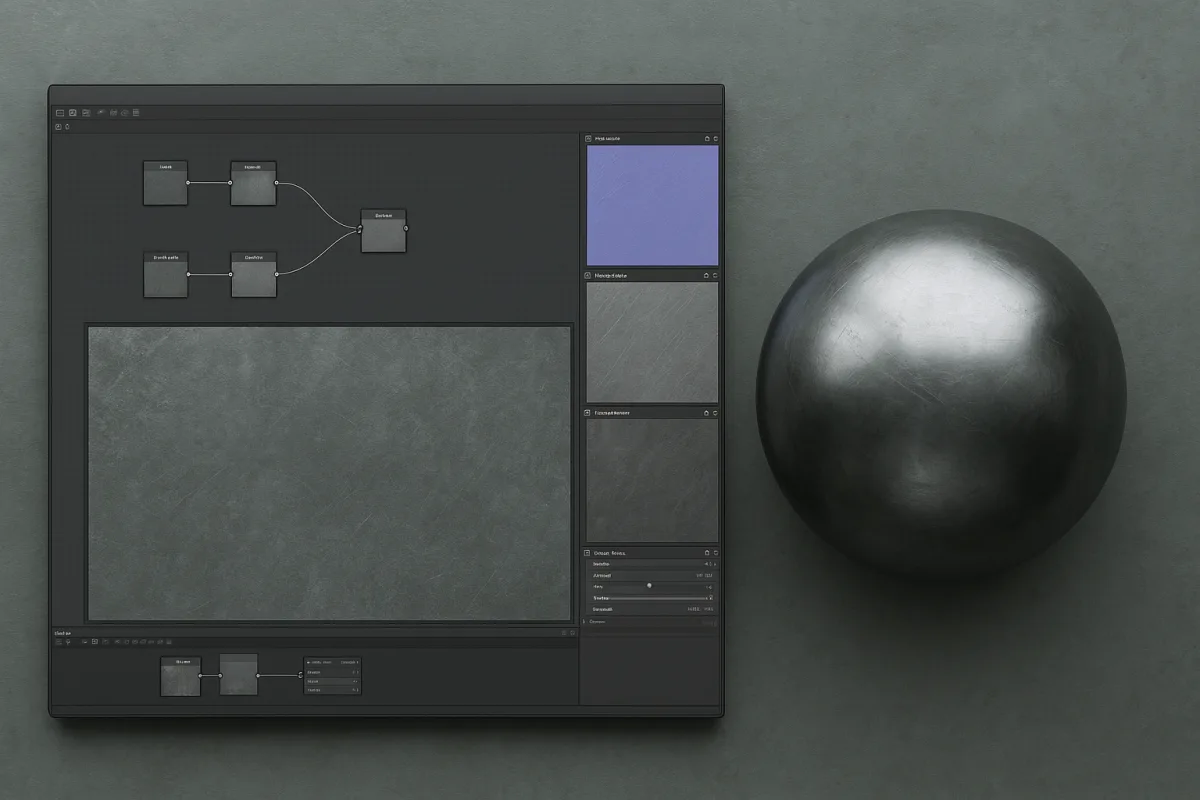
Identify the metal and the condition you are making
You need to decide what the object is made of before you open the graph. “Metal” is too broad a target: polished gold, brushed aluminum, weathered steel, and oxidized copper can all use metallic shading, yet they need very different color, roughness, and surface-detail decisions. [1]
Start with three answers: the metal, the manufacturing finish, and the exposure history. A machined stainless panel needs directional abrasion and controlled reflectivity. A cast iron bracket needs broader roughness variation, structural imperfections, and restrained edge damage.
We would begin with the finish, not the damage. The finish establishes how the surface catches a broad highlight, while dirt, scratches, fingerprints, oxidation, and wear only modify that base condition. Without a believable baseline, extra detail reads as decoration.
Set the PBR values that make the surface metal
In Adobe Substance 3D Designer, a metal material needs a coordinated Base Color, Metalness, and Specular Roughness response. These parameters describe different parts of the same surface, so do not use one map to compensate for another. [1]
Keep metalness generally between 0.8 and 1.0 for metal surfaces. Values outside the usual 0.8 to 0.98 reflectivity range can make a surface look like plastic, paint, or an uncertain hybrid material instead of a conductive metal. [1]
Use Base Color to establish the reflected tint, not to paint bright diffuse color into the material. Oversaturated metal colors are a frequent reason copper, gold, and anodized-looking surfaces become toy-like under an HDR environment. [1]
Gold can sit at roughness values around 0.05 to 0.2 when polished, while steel, copper, and aluminum commonly occupy a wider 0.1 to 0.5 range depending on their finish. These are starting ranges, not material laws. [1]
A polished object needs low roughness with small, controlled variation. A worn or handled object needs a broader distribution, but keep variation tied to events you can explain: contact, abrasion, machining, water exposure, or accumulated deposits.
Build roughness before you build scratches
Open a roughness-only view early in Adobe Substance 3D Designer. This is where you should be able to recognize polished areas, dull handling zones, directional brushing, and oxidized sections before Base Color makes the material look finished.
Roughness variation should exist at several scales. Broad zones describe manufacturing and use, such as a duller center on a touched handle. Mid-scale breakup describes uneven finishing, while micro variation breaks the highlight into a believable surface. [1]
Avoid filling the entire roughness map with high-contrast noise. Random noise makes every part of the object equally old and equally active, even where geometry and use history offer no reason for that treatment.
For a clean machined part, keep roughness changes narrow and directional. For a cast or heavily handled object, widen the variation gradually, but preserve areas of relative calm so the strongest changes still mean something.
Match texture scale to the object
A good procedural graph can still fail if scratches, pits, and oxide patches are the wrong size. Set the expected asset scale and texel density before you judge wear, because surface features must relate to the object’s real dimensions. [2]
Tiny scratches should remain tiny on a large sheet-metal panel. Broad scuffs should not become hairline marks when the material is applied to a small product part. Scale errors make a surface look generated even if every map is technically clean.
For real-time work, hero assets commonly use 4K textures, environment hero assets use 2K to 4K, and background or modular pieces use 1K to 2K. Mobile assets commonly fall between 512 and 1K. [2]
Film and high-end rendering can use 4K to 8K per tile, based on camera distance and asset prominence. Choose the tile resolution for what the camera can resolve, then use compression where the real-time pipeline requires it. [2]
Make the material tile seamlessly if it will cover large surfaces. Stochastic tiling methods can help break obvious repetition, especially in broad brushed, scratched, corroded, or hammered metal areas. [6]
Build height detail in two normal layers
Create the material’s physical surface before relying on a normal map. In Adobe Substance 3D Designer, procedural height generation gives you a controllable source for dents, machining marks, pits, scratches, and raised corrosion, which you can convert into normals. [4]
Separate that information into macro and micro layers. The macro normal should describe structural events, such as dents, seams, hammered irregularity, deep gouges, or substantial corrosion buildup. A macro normal strength around 0.8 to 1.2 is a useful starting range. [3]
The micro normal handles the fine detail that disrupts reflections: faint abrasion, grain, tiny pits, and small scratches. It should remain subtle enough that it changes highlight breakup without looking like embossed geometry from a normal viewing distance. [3]
Do not simply blend normal maps together. Use Reoriented Normal Mapping, or a comparable normal-combining method, so the combined vectors remain correctly oriented and the fine layer follows the larger surface forms. [3]
Simple normal blending can flatten one layer, push details in the wrong direction, or produce artifacts where maps overlap. Those errors become especially visible on metal because sharp reflections reveal small shading problems immediately. [3]
Give brushed metal a direction
Brushed steel and brushed aluminum need directional surface information. Their appearance comes from aligned abrasion marks and a controlled reflection pattern, not from gray Base Color plus a generic scratch overlay. [3]
Use the object’s intended brushing direction to guide both the fine normal detail and the roughness variation. A circular appliance finish, a linear panel finish, and a radial machined face need different directions because their reflections travel differently across the object.
Anisotropy is the parameter to reach for when the reference shows stretched, direction-dependent highlights. Use it with a directional surface pattern, because anisotropy without an authored direction will not explain the finish you are trying to simulate. [1]
OpenPBR also includes controls such as Specular Edge Color, also called F82 Tint, and IOR. Treat these as part of the shader’s physical response, but do not guess specific metal IOR values from memory when your reference and target renderer have not established them. [1]
Add wear that follows the metal’s chemistry
Once the clean material works, decide what the environment has done to it. Copper and bronze can develop green patina, while weathering steel develops rust layers. These are different surface changes and should not share one generic corrosion treatment. [8]
In Adobe Substance 3D Designer, Metal Weathering and Metal Edge Wear generators can provide a procedural starting point. Their results depend on inputs including world-space normals and ambient occlusion, so bake and align those supporting maps carefully. [8]
Use ambient occlusion to suggest protected recesses and world-space data to distinguish upward-facing, downward-facing, and side-facing exposure. Then adjust the result according to the object’s environment instead of accepting a generator’s default distribution. [8]
Wear does not belong on every edge. A protected chamfer can remain clean, while a frequently touched corner may polish, dull, chip, or oxidize depending on the metal, coating, and exposure. Overdone edge wear is one of the quickest ways to lose realism. [8]
Be especially careful with worn edges in the metalness and roughness maps. An edge can change roughness dramatically without ceasing to be metal, while loose oxide, dirt, or a coating may need different material behavior from the substrate beneath it. [1]
Light the graph with reflections you can judge
Load a high-quality HDR environment in Adobe Substance 3D Designer before approving the material. A metal surface gains most of its visible character from reflected surroundings, so flat or poor lighting can hide a good graph or flatter a weak one. [7]
Enable importance sampling in the renderer, then adjust environment exposure and rotation. Rotate the HDR until broad light sources sweep across the surface, revealing whether roughness, brushing, scratches, and normal intensity behave as intended. [7]
Use the PBR Render node for accurate material previews. Check the material against more than one environment or rotation, because a scratch pattern that looks convincing under one narrow highlight may become repetitive or oversized under another. [7]
Do not tune Base Color only under a dark HDR. A low-information environment can make color and reflectivity choices look stronger than they will in production lighting, especially on polished aluminum, steel, and gold.
Audit the maps before export
Before export, inspect Base Color, Metalness, roughness, height, normal, and any masks separately. Misaligned baked maps can cause curvature-driven wear to miss edges or place deposits where the model offers no physical shelter. [8]
Check the roughness map at full view and close range. At full view, it should communicate the finish. Up close, it should carry believable variation without looking like uniform procedural noise or a field of identical scratches.
Check metalness at transitions. If a corroded region, coating, grime layer, or exposed substrate changes material type, make that change deliberately. Do not leave accidental gray values around worn edges because the map became blurred or compressed.
We would skip heavy color contrast and exaggerated damage until this audit passes. Realistic metal materials in Adobe Substance 3D Designer come from calibrated reflection, correct surface scale, and material-specific weathering, with the detail serving those decisions rather than hiding them.
Frequently Asked Questions
How do I create realistic metal materials in Substance Designer?
Start by identifying the metal type, its manufacturing finish, and exposure history to set a believable baseline. Build the roughness structure first to define the surface’s polish or wear, then add scratches and oxidation as modifications. Use coordinated Base Color, Metalness, and Roughness maps without compensating one for another, and always evaluate the material under a high-quality HDR environment for accurate reflections.
What are the key PBR values for metal in Substance Designer?
Metalness values should generally range from 0.8 to 1.0 to avoid materials looking like plastic or paint. Base Color should represent the reflected tint without oversaturation to prevent toy-like appearances. Roughness varies by metal and finish, gold often falls between 0.05 and 0.2 when polished, while steel, copper, and aluminum typically range from 0.1 to 0.5.
How to build roughness and scratches for metal in Substance Designer?
Focus on roughness first, creating variation at multiple scales to represent manufacturing and use, such as directional brushing or oxidation patches. Avoid uniform noise across the roughness map, as it can make the surface appear uniformly aged. Add scratches and wear only after establishing a believable roughness baseline, ensuring these details correspond to realistic contact and abrasion events.
How can I combine normal maps for realistic metal surfaces?
Use separate normal maps for structural (macro) and micro-surface details, and combine them using Reoriented Normal Mapping (RNM) rather than simple blending. This approach preserves vector normalization and maintains the integrity of surface details, resulting in more realistic metal textures.
What scale should textures be for realistic metal materials?
Set texture scale and texel density according to the real-world size of the asset to keep scratches, pits, and oxidation at believable sizes. For real-time assets, hero models often use 4K textures, environment heroes 2K to 4K, and background elements 1K to 2K, with mobile assets between 512 and 1K. Film and high-end renders may use 4K to 8K per tile, matching resolution to camera distance and asset prominence.
How we researched this
This article was assembled from 10 cited references.
Nothing here is based on hands-on testing. Where a figure or finding appears, it belongs to the source cited beside it, and the writing says so rather than implying otherwise. Every source is listed below so you can check it.
Sources
- PBR Metallic-Roughness Materials Explained | MessyPoly
- Substance Painter Game Texturing: PBR Workflow Guide (2026)
- Metal Normal Map PBR Guide: Brushed Steel and Scratches | NormalMap.ai
- 🌄 Creating Height Maps and Normal Maps Procedurally in Adobe Substance 3D Designer, SurfaceMentor
- 3D Texturing Explained: PBR Materials & Maps | Hi 3D
- Tileable Textures and Texture Atlas Creation, Создание сайтов, мобильных приложений, парсеров, игр | Настоящие Технологии | TRUETECH
- Metal Textures for Product and Interior Rendering: A Practical Guide
- How To Add Realistic Wear & Edge Details to 3D Products Using Substance Painter - ITS
- Metal material references | Adobe Substance 3D
- Blender - Wilson Shrestha
Related Articles
Create PBR Materials from Scratch: A Practical Guide
Learn how to create PBR materials from scratch with correct texture maps, workflows, and software tips for realistic 3D rendering.
Best Software for Procedural Texture Creation in 2026
Explore the best software for procedural texture creation, comparing Substance Designer and Houdini for different workflows and material needs.
Create Realistic Forest Scene Blender
Learn how to create a realistic forest scene in Blender with layered ecosystems, procedural trees, lighting, and look development techniques.

Create Realistic Sky in Blender
Learn how to create a realistic sky in Blender using procedural textures, HDRIs, and sun direction for believable outdoor lighting.