
Best Practices for Lighting in 3D Scenes: A Practical Guide
Learn best practices for lighting in 3D scenes, including hierarchy, key/fill/rim roles, and shadow control for better renders.
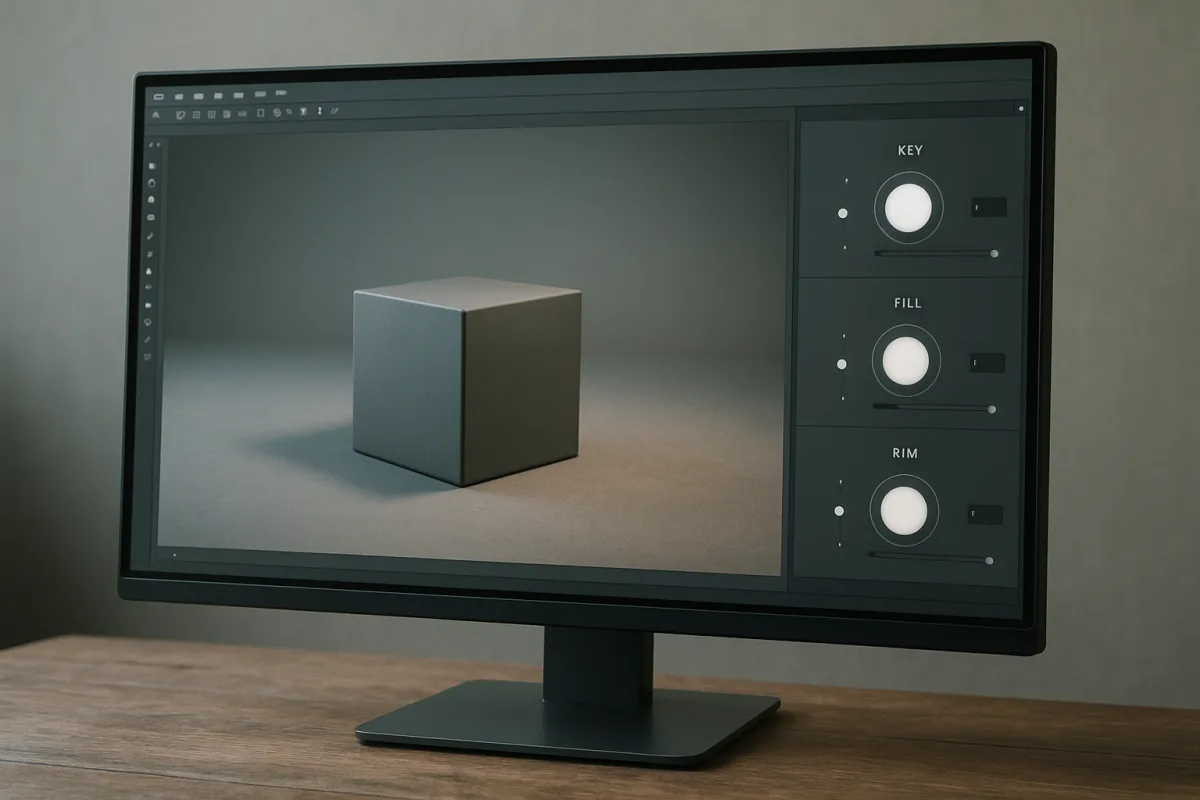
Lighting hierarchy is the part that makes a scene look intentional
The best lighting practice is not three-point lighting, HDRIs, cinematic colour contrast, or a particular render engine. It is establishing hierarchy: deciding which light explains the subject, which lights preserve readable information, and which lights create separation.
That sounds abstract, but it answers the practical question behind most disappointing renders. A scene can contain physically plausible materials, an expensive HDRI, and global illumination, yet still look ordinary because every surface receives roughly equal visual importance.
A light hierarchy gives the viewer an order of operations. First they read the primary plane of the subject. Then they see the material, silhouette, depth, and environment. If those reads arrive simultaneously, the image becomes noisy rather than rich.
This matters whether you are lighting a hard-surface product render in Blender 4.5 LTS, sculpting a presentation turntable in ZBrush, or building an environment for a real-time engine. The controls differ, but the image problem is the same.
A key light is not simply the brightest lamp
The key is the light that most strongly describes form. It establishes the main shadow direction, tells us where the scene’s apparent source is, and usually creates the highest contrast across the subject’s important planes.
Brightness often follows from that role, but it does not define it. A large overcast skylight can be the key in an architectural exterior, even when no individual highlight is intense. A small desk lamp can be the key in a dark interior.
For a conventional portrait or object setup, guides commonly place the key around 30 to 45 degrees to one side of the subject and above it. [7][8] That angle is useful because it gives a form both a lit side and a shadow side.
Do not mistake that placement for geometry you must reproduce. Move the key until it reveals what the model is supposed to communicate. On a character, that may be cheekbones, brow, and eye sockets. On a watch, it may be a controlled sweep across polished metal.
For a vehicle, the key may be less about illumination than reflection. Automotive paint reads through long, coherent highlights, so a large area source or reflection card can describe the bodywork better than a physically small point-like lamp.
That distinction is important. Light does not merely make an object visible. It tells the viewer what its surface is made of. A rough clay sculpt wants broad value transitions, while chrome, clearcoat, and glass need controlled reflected shapes.
Light size controls shadow quality more than the menu label
Artists often say that area lights make soft shadows and point lights make hard ones. It is a workable shortcut, but the more useful idea is apparent size: how large the source appears from the shaded object.
A large source close to the object occupies a broad angle in the object’s view. Rays arrive from many directions, so the edge between lit and shadowed regions spreads into a soft penumbra. The result is gradual shadow falloff.
A small source far away occupies a narrow angle. Its rays travel in nearly the same direction, producing a sharper transition. That is why direct sun can create crisp shadows despite the Sun being physically enormous. From Earth, it appears comparatively small.
This is one reason a scene can look unexpectedly synthetic. An artist may increase a lamp’s energy to brighten an object, but leave its size unchanged. The image gets brighter while retaining tiny, harsh highlights and needle-edged shadows.
Instead, separate exposure from source shape. Increase energy when the scene needs more illumination. Increase source size when it needs broader specular reflections and softer shadows. Bring the source closer when you want softness without raising its total output indefinitely.
That is a habit, not a universal rule. A stylised render may want an unnaturally hard key, and a noir image may depend on it. The point is to make hard or soft shadows a visible decision, rather than an accidental default.
Fill is a contrast control, not a second key
Once the key establishes the form, the fill decides how much information remains in shadow. It is the most direct control over the scene’s contrast ratio, which is why excessive fill is one of the quickest ways to flatten a render.
Three-point lighting references commonly place fill on the opposite side of the key, often 60 to 90 degrees away, at roughly 20 to 50 percent of the key’s intensity. [7][8] Those figures are starting positions, not physical laws.
At the low end, the fill retains a little material detail without competing with the key. At the high end, it makes a subject feel more open, commercial, or diffuse. Push it too far and the shadow side stops explaining volume.
A useful diagnostic is to disable the fill temporarily. If the scene suddenly gains a strong read, the fill was likely doing too much. Bring it back only until the lost information becomes legible, rather than until both sides appear equally exposed.
Global illumination complicates this, because bounced light already acts as a natural fill. Ray- and path-traced renders calculate light bouncing from walls, floors, and nearby objects, improving realism at a potentially substantial render-time cost. [3][24]
In a physically based interior, a separate fill may be unnecessary or may double-count the room’s existing bounce. In a quick product shot, though, a deliberately placed fill can be cheaper and easier to art-direct than waiting for many indirect-light samples.
That is the larger principle: fake bounce light when it serves the image and the production limit. It is not dishonest. A viewer judges the final light distribution, not whether every lumen reached its destination through a mathematically complete path.
Rim light earns its place by solving silhouette problems
A rim, or back light, sits behind the subject relative to the camera. Its job is to create a narrow edge of illumination that separates the subject from a similarly valued background. It should clarify the outline, not trace it everywhere.
Guides commonly suggest rim light levels around 150 to 250 percent of the key, though the wide range itself shows why this is a visual judgement rather than a fixed setting. [7][9] Dark subjects often need more separation than pale ones.
The common failure is making the rim equally visible all around the model. That turns the object into a cut-out sticker, especially on hair, foliage, or hard-surface edges. A good rim often disappears across much of the silhouette.
Aim it at the area where subject and background merge. If a dark jacket vanishes into a dark set on one shoulder, a controlled rim there may solve the problem. A full 360-degree outline usually announces the lighting setup instead.
Why an HDRI rarely finishes the image by itself
An HDRI is valuable because it contains a wide range of scene brightness, colour, and directional information. It can supply ambient illumination, believable reflections, and environmental colour variation that would take many manually placed lights to imitate. [3][14]
But an HDRI is not a complete lighting plan. If its brightest feature is broad, low, or badly positioned, the subject may receive pleasant ambient light while lacking a clear directional key. The result can look realistic in isolation but flat as an image.
Rotate the HDRI before changing its strength. A small change in rotation can move a bright window, sun, or sky patch from an unhelpful surface to the plane that needs definition. Incorrect rotation is a recurring cause of unconvincing HDRI renders. [3][14]
Resolution matters as well. A low-resolution environment can still provide broad ambient illumination, but it breaks down in sharp reflections. Polished metal, glossy plastic, and glass expose blurry environment maps immediately because those materials effectively display the world around them.
Exposure is the other trap. Raising HDRI strength to brighten a shadowed subject can blow out the environment’s brightest areas, flatten contrast, and make reflections look clipped. It is often better to retain the HDRI’s character and introduce a separate key or fill.
In Blender 4.5 LTS, that may mean using the world HDRI for environmental contribution and reflections, then adding a large area light specifically to shape the asset. Blender’s light-object documentation distinguishes directional, point, spot, and area sources because each produces meaningfully different behaviour. [25]
That split is not a hack. A studio photographer might use a window for ambient context, a softbox for the key, and flags to control reflection. In 3D, using an HDRI plus direct lights is the equivalent of choosing each light’s role deliberately.
Use real-world numbers as anchors, not targets
Lux and Kelvin values can help when you have no initial reference. Lux describes illuminance on a surface, while Kelvin describes the apparent colour temperature of a source. Both give a starting vocabulary for matching a reference image. [5][26]
Warm sources commonly fall around 2700 to 3500K, neutral light around 4000 to 5000K, and cool daylight-like sources around 5500 to 6500K or higher. [2][24] These ranges describe tendencies, not moods that software can guarantee.
A warm key against a cool ambient environment can create depth because it separates the subject from the background in colour as well as value. But colour contrast cannot rescue unclear form. Establish the value hierarchy first, then tune colour temperature.
There is no comprehensive, software-agnostic standard that says a particular kind of interior, product, or character must use one lux level or one Kelvin number. Exposure transforms, tone mapping, camera settings, and artistic intent all change the visible result.
Use measured values when recreating a known lighting condition. Use them less rigidly when making an illustration or cinematic frame. A render does not become more believable merely because its numeric input resembles a real-world light meter reading.
The target medium changes the acceptable solution
A path-traced still image can spend samples on soft indirect light, detailed reflections, and clean contact shadows. That makes it well suited to subtle material evaluation, but global illumination and noise reduction come with substantial computation costs. [3][24]
A real-time scene has a different budget. Techniques such as screen-space global illumination, baked lighting, reflection probes, and selective shadowing trade physical completeness for frame rate. Modern game rendering routinely combines such approximations rather than tracing every light path. [15][27]
Virtual reality tightens the constraint further because lighting must remain convincing while sustaining a high frame rate across two views. A beautiful lighting setup that produces unstable performance is not a successful VR setup, however accurate its indirect illumination may be. [16][27]
This is why “realistic lighting” is an incomplete brief. Ask whether the image is a single frame, an animation, an interactive walkthrough, or a headset experience. The answer determines whether to calculate bounce light, bake it, fake it, or omit it.
A practical hierarchy check before rendering
Start by turning off everything except the key. If the model’s most important shape does not read, move or resize that source before adding complexity. The key should make the main design decision visible on its own.
Next, add environmental light or an HDRI. Watch what it contributes to reflection and broad ambience. If it destroys the key’s shadow structure, reduce it, rotate it, or reserve it for reflections while rebuilding the illumination with direct sources.
Then add fill only where the key has hidden information that the viewer genuinely needs. Add rim only where the subject merges with its background. This sequence prevents every lamp from becoming a competing key.
Finally, inspect contact points. A character’s feet, a product on a plinth, and props against shelves need localized darkening or properly calculated occlusion to feel grounded. Contact shadows are disproportionately important because they explain physical connection. [3][12]
Lighting gets better when each contribution has a reason to exist. The scene does not need every available technique. It needs a primary light that describes form, supporting light that protects useful information, and enough restraint to let the viewer see the difference.
Frequently Asked Questions
What are the best practices for lighting in 3D scenes?
The best practice is to build lighting around a clear hierarchy rather than simply adding many lights. Decide what the viewer should notice first and let other lights support or contrast that focus. Additionally, judge lighting rigs first in grayscale to ensure clear value structure before adding color, and match lighting methods to the output medium, balancing realism and performance needs.
How do I establish a lighting hierarchy in 3D rendering?
Establish hierarchy by deciding which light explains the subject’s form, which preserve readable information, and which create separation. This order guides the viewer’s attention from the primary planes of the subject to material, silhouette, and environment. Without hierarchy, scenes can appear noisy because all surfaces compete for equal visual importance.
What is the role of key, fill, and rim lights in 3D scenes?
Key light defines the main form and shadow direction, often placed 30 to 45 degrees to one side and above the subject. Fill light controls contrast by illuminating shadow areas at roughly 20 to 50 percent of the key’s intensity, preventing shadows from becoming too dark. Rim light, typically placed behind the subject at 150 to 250 percent of key intensity, helps separate the subject from the background. These roles are jobs rather than fixed rules.
How does light size affect shadow quality in 3D renders?
Light size affects shadow softness by changing the apparent size of the source from the subject’s perspective. Larger sources close to the object produce softer shadows with gradual falloff, while smaller or distant sources create sharper, harder shadows. Adjusting source size independently from brightness helps control shadow quality intentionally.
When should I use HDRI versus direct lighting in 3D?
Use HDRI primarily as environmental and reflected information rather than a complete lighting setup. Rotate and expose HDRIs correctly, and add a direct key light when the subject needs defined shape and form. Overreliance on HDRI alone can produce flat or poorly lit scenes, so supplementing with direct lighting is important for clarity.
How we researched this
This article was assembled from 27 cited references.
Nothing here is based on hands-on testing. Where a figure or finding appears, it belongs to the source cited beside it, and the writing says so rather than implying otherwise. Every source is listed below so you can check it.
Sources
- Blendify -- Python rendering framework for Blender
- 3D Lighting Techniques: Complete Guide for Artists
- Lighting Techniques in 3D Rendering: HDRI, Ray Tracing, Realistic Shadows | Space Visual Blog | Space Visual
- Master Lighting Techniques for Stunning 3D Renders | Hitem3D | Hi3D Blog
- Light Levels — CGI Tools
- Key-Fill Modeling Technique – Lighting Design Online
- Three Point Lighting 2026: The Setup That Works at Home, Studio & Beyond - GVM Official Site
- How to use key, fill and rim lighting in 3D art
- Cinematic Lighting in Blender: 3-Point Rigs, Rembrandt, Rim Light & Filmic Exposure | PixelSanctuary
- Key/fill/rim concepts | 3D Support | Am I Industry-Ready?
- ZBrush Tip: LightCap studio lighting workflow for ZBrush
- Common 3D Rendering Mistakes and How to Avoid Them – ProPixel Agency
- 10 Common Mistakes in 3D Exterior Renderings for Architects
- HDRI Lighting for Interior 3D Rendering
- Unreal Engine Rendering — Real-Time Viz Guide
- 3D Rendering Trends 2026: Visualization Report
- AMD presents new method of handing indirect lighting off to an image generation model: 'frame-by-frame' solution could be part of AMD's answer to DLSS 5 someday
- Katana — 3D Lighting & Look Development Software | Foundry
- Universal Shader Library — PBR Materials & Shaders for Blender, Maya, Houdini & Unreal - PixelConstruct
- MetroLights | Nodely Tools
- KeyShot for ZBrush
- Substance 3D plugins & compatible software - Adobe
- Simulation 3D Scene Configuration - Scene configuration for 3D simulation environment - Simulink
- 3D Lighting Fundamentals for Realistic Renders | IRPR 3D
- Light Objects - Blender 4.5 LTS Manual
- Intensity/Color/Attenuation Rollout (Photometric Lights)
- A short list of rendering techniques used in modern AAA games | Cinevva
Related Articles
Best Lighting Techniques for Blender Rendering
Discover the best lighting techniques for Blender rendering using Cycles and Eevee to create realistic, well-shaped 3D models.
Realistic Water in Blender
Learn the best techniques for creating realistic water in Blender using Ocean Modifier, fluid sims, and layered shading for stunning results.
Realistic Hair Techniques in Blender: Guide to Particle Hair
Learn realistic hair techniques in Blender using particle systems, guide hairs, and grooming tools for natural, believable hairstyles.
Blender 5 Beginner Tutorial Series: Learn 3D Modeling Basics
Explore a Blender 5 beginner tutorial series that teaches 3D modeling, topology, lighting, and rendering with a focus on workflow dependencies.